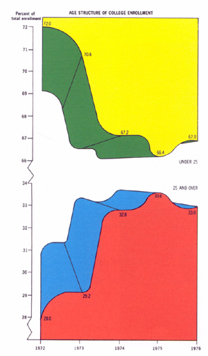
Infographic
 Original by Phil Gyford, rearranged by Paul Mison [via].
Might it have something to do with this?
Here’s the other end of the spectrum. (I tried to do this recently with books: pages-per-day estimated from page counts and start/finish reading dates. Scrapped the project for a number of reasons: (a) I had to fill in pagecount manually, (b) my reading records were patchy and have since gotten even patchier, (c) given a small data set and not much continuity (tendency to finish one book before starting the next) the colours are not as informative and interesting, and (d) my attempt at making graphed area precisely informative turned out more confusing than I expected.)
Comments
Also the other end of the spectrum: Megan Jaegerman (via Edward Tufte). You have, of course, read the complete works of Edward Tufte.
The Mega Shark one is actually the same kind of thing he's complaining about: it's a very large, complicated display of a very small amount of data. (Still beats the iPad wank hands down though.) But compare it to the Jaegerman: there doesn't seem to be any simpler way to display that information, apart from just skipping the graphics entirely.
Tufte: I have The visual display of quantitative information and was surprisingly disappointed. It's good, but not (to me) raveworthy -- seems a bit like a personality cult has puffed it somewhat. (Maybe the later work is better -- at some point in The Visual Display he suggests reworking the design of box-and-whisker plots to reduce the number of times you have to reorient your ruler.) That said, there are some very lovely examples -- I especially like the train timetable featured on the cover (designed by E.J. Marey; Tufte puts the modern high-speed train on the same schedule; it's a nearly-vertical line). And the negative examples can be fun too.
Time to haul out the Supreme Nut Mix again. That never gets old.
Meant also to mention The Selected Works of T.S. Spivet. The story is a big disappointment (strong start, scatters everywhere and never recovers) but design is just beautiful. Tufte would disapprove heartily (lots of chartjunk) but it's lovely to look at.
I don't want to say the Mega-shark one is perfect, but its close. You could add more information, but if your goal is dense information use a table. Infographics are both informative and entertaining (note the iPad one fails at both). They're enjoyable to read which means that balancing the amount of data with clarity is important.
That's why the Mega-shark one is so good, it not complicated (compare it to the iPad one), and makes great use of the space (the Jaegerman one is really just a grid, its informative but not as beautiful as the mega shark one.)
The whole discussion is moot though since one relates to a shark that leaps out of the water and eats planes and the other is based on...you know real things.
I guess there are two kinds. Mega-Shark and Gun-carrying are about lively and interesting presentation of a (small but odd) data set; the train timetable is about compact and vivid presentation of a large data set. (You could show that with a table, sure. That's how most timetables are given; this is much better!)
But yes, I freely admit that Mega-Shark beats Gun-carrying on any reasonable scale of awesome. If only the timetable was for Earth-Mars passenger shuttle services...
Re Tufte: personality cult aside, I agree with most of what he says in Visual Display. In defence of his box-and-whisker redesign: (1) he mentions straight-edge reorientation as a useful side-effect, not as motivation! (2) this was 1983, when most data graphics were done by hand, and achieving equivalent quality by computer would often have been very difficult. I love the train timetable too (and of course Napoleon's invasion), but the whole book's stuffed with paragons -- even without the text it would be a good read.
Re T. S. Spivet -- coincidentally, our department administrator lent me a copy of this shortly after I read your recommendation. He had concluded that it would be my kind of thing. Not that much chartjunk actually except the ubiquitous grid squares, which are presumably because the notebooks are gridded. Alas, I won't have time to read it properly.
Re 'The Jaegerman one is just a grid' -- which one? There are dozens on that page. Some admittedly a little workmanlike, but many of the sport ones are impressive.
Tufte: sure, he's right! It just doesn't seem so revolutionary to me. And yes, 1983 was a long time ago in data graphics. My point is that the book would be almost just as good a read without the text: its the examples that carry it.
Spivet chartjunk: Layton's Rocking Horse (pg 87 my edition) shows elevations for the horse's nose and tail.
Conversely: http://staubman.com/blog/?p=67